My Contrast color tool finds correct color contrasts for web accessibility (WCAG). This helps you in satisfying web accessibility tests on contrasts.
Why color contrast is important
On websites and apps, light text should have a dark background and dark text should have a light background. Otherwise, readability is insufficient for color-blind or visually impaired users – and often also for other users. How can you ensure your design has sufficient color contrast?
Legal requirements
According to the law, texts and icons on the websites of (semi-)governmental organizations must present a sufficient contrast between light and dark. Otherwise, they are not accessible to everyone. This criterion is specified in the digital accessibility guidelines established by the Web Accessibility Initiative, notably in success criteria 1.4.3 and 1.4.11. The link to W3 below this article will take you to more information on this topic.
How big should the contrast be?
Most text requires a color contrast of 4.5:1. Text with large letters (18 pt. or 14 pt. if it is bold text) and large icons only need a contrast of 3:1. To find out the contrast between two colors, you can enter them into special tools that calculate it.
Better readability
Readability depends on how easy or difficult it is to read something.
Readability depends on the presentation of a text (such as the choice of font, spacing or colors) and the context (the words and sentences on the page).
Other factors that affect readability include sentence length, sentence structure, and the average number of syllables per word. These factors combined help gauge how well your writing will be understood.
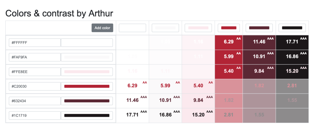
My tool for better contrast
I have developed a tool for better contrast of colors that requires all the standards. In the example here below you’ll see a combination of 6 colors I have used for one of my clients.
Dealing with corporate identity
The design of a website is usually tailored to the corporate identity of an organization. It is most useful if the corporate identity is (re)developed simultaneously with the web design. Then you can immediately include accessibility, and especially contrast, in the design process. In other cases, however, you have to base the web design on an already existing corporate identity – and then it sometimes becomes more complicated to provide sufficient color contrast.
More tools for color contrast
Tanaguru contrast finder
One of the free tools to measure the contrast between two colors is the ‘Tanaguru contrast finder’. The advantage of this tool is that it also offers alternatives when the entered colors appear to have too little contrast. The disadvantage of the tool is that the RGB or Hexadecimal value of a color must be known, which is not the case with many PDF files, for example.
Color Contrast Analyser
The ‘Colour Contrast Analyzer’ is another free tool to measure color contrast. With this tool, the color values do not need to be known. The disadvantage of the Color Contrast Analyzer is that it often cannot be used on government computers because they have security blocks that prevent the installation or execution of unknown software.
Firefox’s Accessibility Inspector
Web browser Firefox has created a tool for web developers to test the accessibility of their design: the Accessibility Inspector. With this tool, the designer can check, among other things, whether the color contrast between text and background is sufficient. You will find more information about this tool in the link below this article.